

Sometimes it's hard to know where to start when thinking about working with data. So we created two courses for our friends at School of Data on 'A Gentle Introduction To Cleaning Data' and 'A Gentle Introduction To Exploring And Understanding Your Data.' School of Data works to empower civil society organizations, journalists and citizens with the skills they need to use data effectively in their efforts to create more equitable and effective societies.
A Gentle Introduction To Cleaning Data
Gives you a overview on what can go wrong in spreadsheets and how to fix it if it does, take this course if you want to learn why it's important to clean data and how to do it.
It’s quite hard to get emotional about data, but let’s try. Stop what you’re doing for a minute. Look at the picture below. What joy! The yellow smiling bears … what a scene! All that’s missing is fireworks.

Image source: China Daily / Reuters, 17 January 2006. Image rights reserved.
Now, imagine the disappointment of finding out that your attempt to create the world’s largest ice cream cake had been ruined because of a spreadsheet error caused by a single blank space in the column called “quantities of ice cream”. It’s not a nice feeling is it? (Luckily this didn’t happen, and probably nobody got fired, and everyone is very happy with the truly meaningful achievement of creating an 8 ton ice cream cake).
Errors in data and the tools used to manage it are common enough that there is actually an international organisation called the European Spreadsheet Risks Interest Group that advises on how to reduce the errors people make when using spreadsheets. ESRIG tracks “horror stories” of where data errors in spreadsheets have led to real consequences. These include billions in missing oil revenue, tens of thousands of Olympic tickets being oversold, and huge salaries being given because of accidentally inserted zeros. Some errors are deliberate and criminal. Others are just down to the complexity of managing data. Some errors occur because of the way spreadsheets behave.
This School of Data course is a gentle introduction to reducing errors by cleaning data, which means a number of things, including:
- finding and removing unwanted bits of data in spreadsheets
- formatting data correctly for the tools that you are using
- dealing with inconsistencies in the data
- structuring it so it can be used effectively for what you want it to do
Course requirements
A gentle Introduction to cleaning data builds on the School of Data course called Data Fundamentals, which covers the basics of working with data.
To do this course you will require the following:
- a spreadsheet tool, such as Excel (which costs money) or Libre Office (which doesn’t), installed on your computer. We assume you know how to do this.
- some basic knowledge of using a spreadsheet, including creating files, entering data and simple formulae into cells, selecting, copying and pasting data. If you want to brush up on these things, the Knight Digital Media Centre has an excellent set of basic tutorials on spreadsheets.
- a copy of the course dataset, which is GRAIN’s data on “land grabbing”. We have used this data both because it is an interesting dataset, and because it speaks to the experience of activists in researching and pulling data together about and issue.It also provides a full set of really excellent problems that we can work to solve. Finally, we will also be using it as the basis of the course on descriptive analysis of data, which is coming soon.
Course outline
Section 1: Nuts and chewing gum looks at the the way data is presented in spreadsheets and how it might cause errors.
Section 2: The Invisible Man is in your spreadsheet is concerned with the problems of white spaces and non-printable characters and how they affect our ability to use the data.
Section 3: Your data is a witch’s brew deals with consistency in data entry, and how to choose the right unit and format for data.
Section 4: Did you bring the wrong suitcase (again)? is about where to put data, and how to structure it.
Accompanying these sections is a step-by-step recipe for cleaning a dataset. This is an extensive, handbook-style resource which we refer to in each section. It takes a set of ‘dirty’ data and moves it through the different steps to make it ‘clean’.
Each section of this course contains:
- An introduction to the challenge: we’ve tried to explain the problems in a helpful, lighthearted and possibly inappropriate way.
- A quick task which should take around 15 minutes to familiarise yourself with the issue. We’ll usually ask you to make or do something, and post your work in the section’s discussion area.
- A longer task taken from the data cleaning recipe. Some tasks are short, but others may take up to an hour.
- A reading list containing useful references and resources. We have included links to essays, spreadsheet product help pages, blogs and so on.
- A question about the material in the section which you can answer in the discussion area. Please post comments on each section, share your thoughts and give feedback on your progress.
How to do this course
We suggest that:
- You go through sections 1-4 and do the quick tasks first, and then do it again with the longer tasks based on the data cleaning recipe.
- Don’t suffer in silence. We know you’re persistent and driven to learn and we’re here to help.
Set up? Ready to go?
Good. Then get cracking with Section 1: Nuts and chewing gum.
A Gentle Introduction To Exploring And Understanding Your Data
This courses builds off 'A Gentle Introduction To Cleaning Data' and demonstrates how to use pivot tables to explore data and gain insights quickly.
2 + 2 = ___
Your resistance to answering this question is futile: you’ve probably just answered it without even thinking.
We doubt it’s controversial to say that many of you taking this course have the instinct and itch to know what a column of numbers adds up to, or how the numbers are spread across the different categories in the dataset in front of you. Spreadsheets make this sort of descriptive analysis easy by giving you a kit of mathematical functions to add, subtract, multiply, divide and create averages and percentages from numbers. We think that you know how to use some of these, but if you want to brush up your skills, run through our data fundamentals course on analysing data.
However, the spreadsheet also has another powerful descriptive analysis tool called pivot tables. In a nutshell, this is what they do:
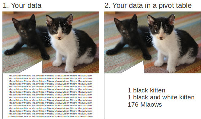
Image: “More Kittens”, courtesy Hitchster. Some rights reserved: CC-BY 2.0. Adapted by Tactical Tech.
Pivot tables summarise complete datasets without you having to write formulae, create new columns, or arrange your data in any particular way. They enable you to combine data in ways that reveal the relationships that exist in the data, and show it to you in a new light. They don’t change your data, they have a stack of useful functions built in and using them effectively can cut down on a lot of repetitive tasks, saving you time.
A combination of a number of spreadsheet functions – like sort and filter, and some formulae – work in a similar way to pivot tables in that they enable you to rearrange and pull out small bits of data more easily. Pivot tables do these things for the complete dataset, and present it to you so you can see it all.
Upon completion of this course, you will:
- understand the basics of pivot tables and how they work;
- have created around 20 different examples of pivot tables;
- be able to build and adapt the layout of pivot tables; and,
- be able to use pivot tables to examine and explore a dataset.
This course is quite short. We suggest you work sections 1 to 4 in sequence, as later sections probably won’t make much sense on their own. You can start the course here.