

Visualisation Tools
I want to:
- combine or integrate data from different sources
- clean an existing data set
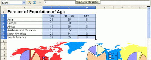
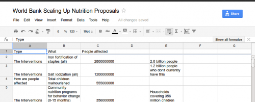
- show a table with text and figures
- compare numbers or how often words appear
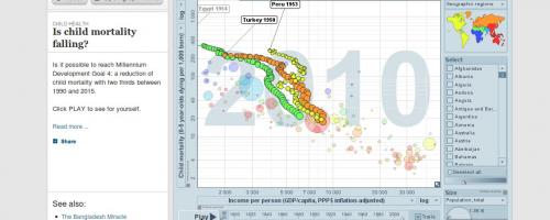
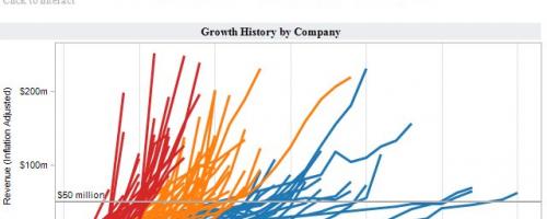
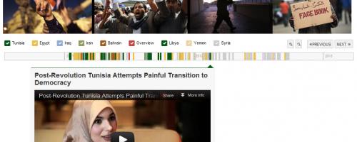
- show changes over time
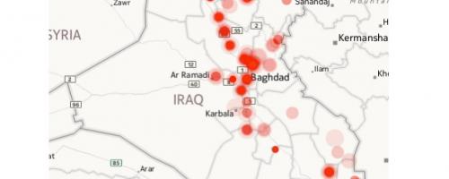
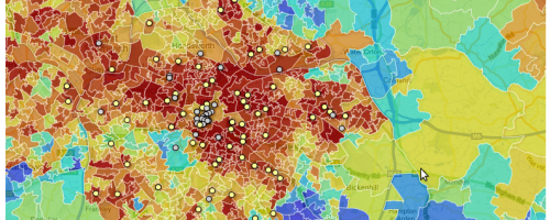
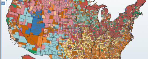
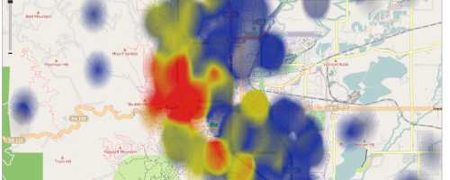
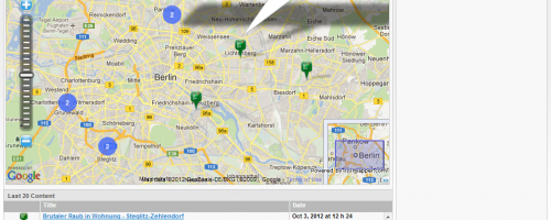
- show things on a map or create a new map
- show the structure of a network
- create or modify an image
- create a presentation or layout
Tools for me →
Whether you are trying to clean your data, spot patterns, or create a data visualisation, there are many free tools available online. Finding the right tool for your need and skill level, however, can be difficult. We have been testing out tools and profiling them below to help you decide which ones are best for the job you are trying to do.
Choose what you want to do in the panel to the left. Below, you'll see a list of tools tailored to help you get there.
With QGIS – previously known as Quantum GIS – you can create, edit, visualise, analyse and publish geospatial information. It is a free and open-source desktop application.
_0.png%3Fitok=N0GoWtH0)
Pure Data is an open source visual programming language designed for musicians, visual artists and performers to create software graphically, without writing lines of code. It is used to process and generate sound, video, 2D/3D graphics, but also interface sensors, input devices, and old-school MIDI files.
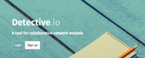
Detective.io is an online platform to store, browse and analyse data related to an investigation. It is designed for journalists, lawyers, business intelligence and researchers who need to organise data that is too complex for spreadsheets and too large to store in plain text formats.

You like mapping, kites, balloons and DIY? Then the Kite and Balloon Mapping kit by the Public Space Lab is what you are looking for.
Exhibit lets you easily create web pages with advanced text search and filtering functionalities, with interactive maps, timelines, and other visualizations.
Processing is an open source programming language built for the electronic arts, new media art, and visual design communities with the purpose of teaching the fundamentals of computer programming in a visual context. The project was started in 2001 by Casey Reas and Benjamin Fry, both formerly working at the MIT Media Lab.
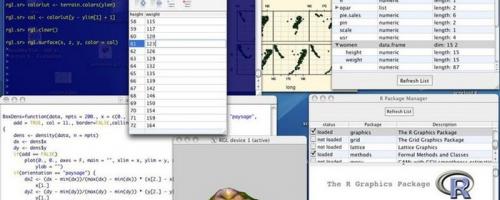
The R project is a highly extensible language and environment for statistical computing and graphics. It provides a wide variety of statistical, such as linear and nonlinear modelling, classical statistical tests, time-series analysis, classification, clustering and graphical techniques.
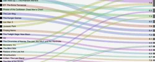
RAW is a web app that can be used to create vector-based visualisations by drawing on a d3.js library through a user-friendly web interface. You can use RAW to visualise flows, clusters, hierarchies and correlations by displaying data on one of the many available complex charts.
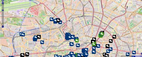
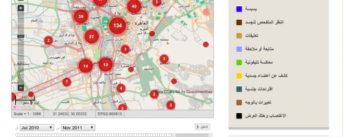
This is a web tool to create interactive maps. It helps users with no coding skills to create interactive maps, while programming-savvy users can use its API and Javascript library to create more advanced maps.
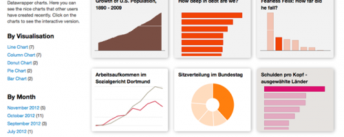
This tool allows you to create basic interactive data visualisations, including pie, line, bar charts and maps.
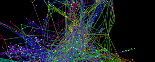
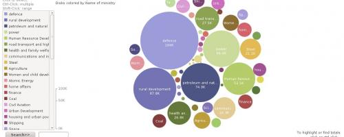
Gephi is an interactive tool for exploring, visualising and understanding large network graphs.
This is an online map of the world, created by people who wanted a new, fully adaptable, free-to-use map.
This is a web site that was built to enable citizens to both report and get alerts about violent incidents happening during elections in Kenya in 2007.
This is an online service inspired by the fact that there is more and more data in the public domain that could be made more useful.
This is a free-to-use online map that you can look at in your Internet browser. It has been online since 2004. It has the usual sorts of data you would expect in a map, including place names, roads and public infrastructure.
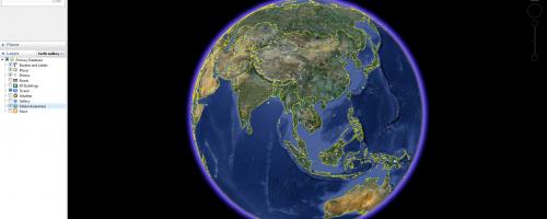
Google Earth is a free desktop application that allows you to view a three-dimensional map of the world, add your own information to the globe and explore information that other
Impress.js is an online, open source tool for building your own presentations similar to Prezi.
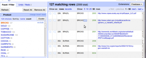
This is a tool for finding and correcting errors in data. All datasets have errors and inconsistencies in them.
This is a spreadsheet application to create, store and analyse any kind of data, whether it's financial information about your organisation or a list of companies fined for violating environmental laws.
This is an online spreadsheet tool and is part of the “Google Docs” suite of office tools. It is free to use, but as with all Google tools you will need a Google account.
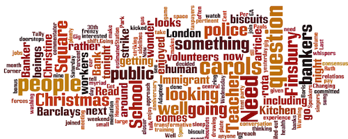
This is an online tool that makes word clouds out of any text – including texts found in blogposts, news articles or web pages. It analyses whatever text you give it and counts how often each word is used.
This is a piece of software for making maps, charts and diagrams using your own data. Visualisations made in VIDI are interactive and can be embedded on your website.
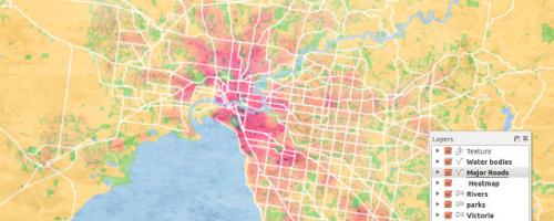
This is the free to use version of the commercial data analysis and visualisation software called Tableau Desktop (which costs US $1000). You can use it to make interactive charts, graphs and maps from your data.
This is an online tool for creating presentations that zoom in and out, rather than flicking through slides like with Microsoft Powerpoint.
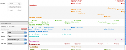
This is a tool that helps you to make sense of time-based data through the use of timelines and chronologies.
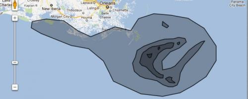
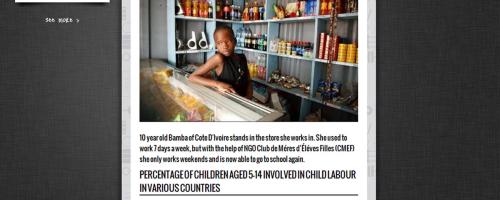
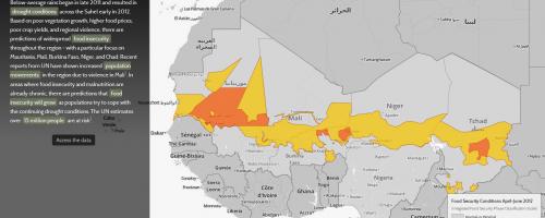
This is an online mapping tool that helps you tell a story and communicate complex information through eye-catching maps.
A free web service that automatically maps news from any Rich Site Summary (RSS) feed. The only condition is that the news item or blog post must contain a location in the text of the RSS feed that Google Maps can recognize.
This is free software for Linux and MacOS that can create rich and detailed timelines.


Yahoo Pipes is a free online service that enables you to grab, mix and filter data. You can output the results in feeds, lists or on maps.
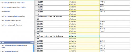
This is an online tool that can be used to reformat, clean up and organise your dataset.
This is a website where you can visualise data such as numbers, text and geographic information.