


Gephi is an interactive tool for exploring, visualising and understanding large network graphs.
Gephi is a great tool to use if you have collected data that examines the connections between points that make up a network, such as informational, biological or social networks. Visualising your data as a network of interconnections helps reveal patterns and behaviour, analyse interconnections and discover entries that seem like anomalies. It uses a 3D render engine, the same technology that many video games use, to create visually amazing graphs. Gephi can be used to explore, analyse, spatialise, filter, cluster, manipulate and export all types of networks.
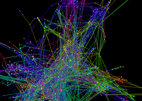
Some of the Gephi examples appear overwhelming at first glance. However, it is possible for a viewer to explore and understand them by clicking through. To better use this tool it is helpful to understand the basics of network graphs such as the differences between 'nodes' and 'edges'. A node is a point, or a location, like a source or a target, and edges are connections between nodes. A directed graph has both nodes and edges. For example, if you were using Gephi to analyse your twitter followers then the nodes would be your twitter followers and the edges would be the connections between them.
The higher the frequency of connections from each node the more compact your graph will look and the harder it will be to see what's going on. However, you can easily navigate this by using the zoom function. By adding text description labels, the finished graph will allow the user to read text labels with a simple mouse-over on a node. Gephi offers users options to change the design of the graph to increase clarity and readability. Users can change the design of nodes, edges and labels through changing the colours, size and fonts. Gephi has a timeline function so any values that are entered into the tool that have a time element will activate the interactive timeline function.
it has the 'wow' factor due to its great graphics (especially the 3D function) and along with its interactive element Gephi brings your data to life.
feeling overwhelmed by Gephi's user interface and options offered, though it quickly becomes easy to navigate and there is lots of help online. Look out for errors in your dataset (particularly empty rows), as they are not easy to filter out and can cause problems with your graph.
Steep
It can only be used as a desktop application.
After you have imported your dataset into Gephi you will see your data represented in a random position until you have chosen the particular 'Layout' option that you want to display your data in. You can then use your mouse to move and scale the visualisation. After you have specified your chosen layout you can adjust the colours and size of your nodes and labels through the "Ranking" tab. If you view your graph in "Preview" you can use a variety of features to make it look more visually appealing. The default mode of Gephi is 2D so if you want your graph in 3D you have to enable the 3D mode by selecting "Sphere 3D." Create filters that can hide nodes and edges on your graph that you can then use to search your dataset. Export the files through either PDF or SVG and with SVG you can transform and manipulate files in Inkscape or Adobe Illustrator.
CSV, GDF, GEXF, GraphML, GraphViz DOT, Netdraw VNA, Tulip TLP and UCINET DL.
GDF, GEXF, PDF and SVG.
Brazilian Portuguese, English, French, German, Japanese, Russian and Spanish.
Gephi can only be used offline as a desktop application so is suitable for those working with private or sensitive data.
Gephi Consortium
GNU LGPL
The Telegraph newspaper used Gephi to map leaked emails from Bashar al-Assad and his wife Asma.
This video clip demonstrates the network of retweets with the hashtag #jan25 at the announcement of Mubarak's resignation through using the timeline function in Gephi.