


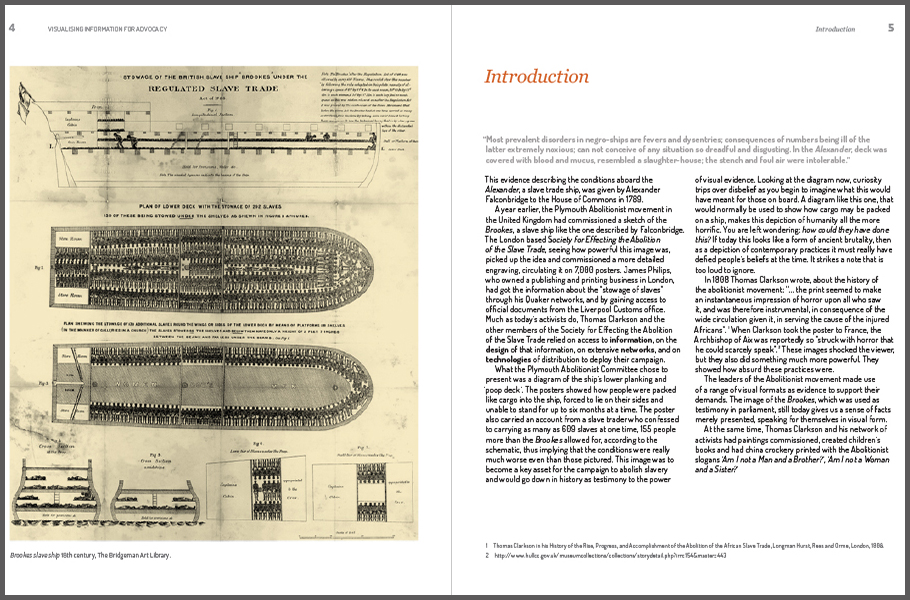
By Mushon Zer-Aviv, January 31, 2014
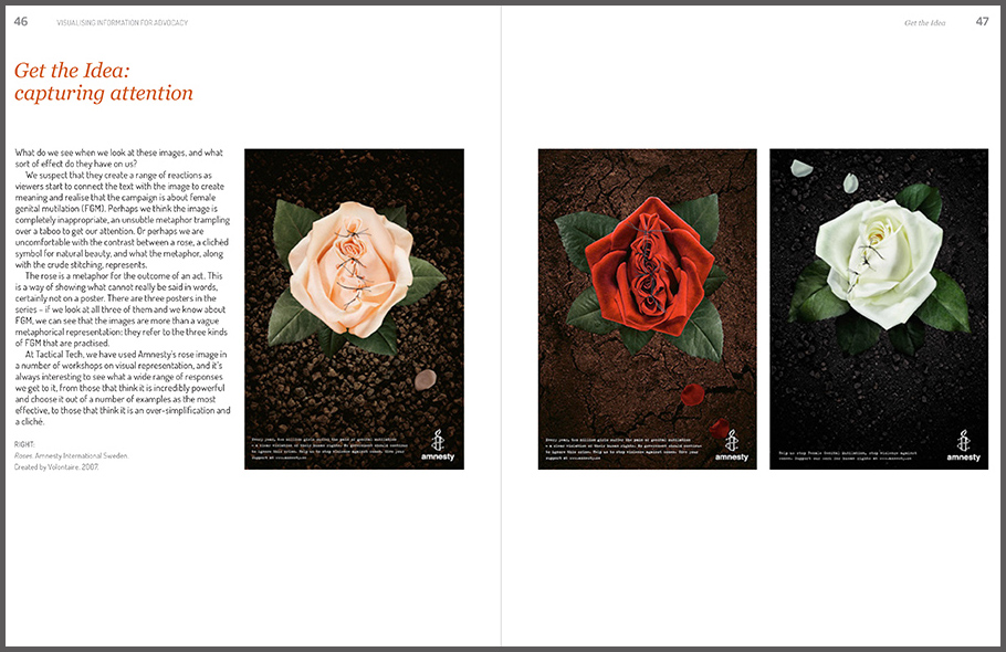
Seeing is believing.
When working with raw data we’re often encouraged to present it differently, to give it a form, to map it or visualize it. But all maps lie. In fact, maps have to lie, otherwise they wouldn't be useful. Some are transparent and obvious lies, such as a tree icon on a map often represents more than one tree. Others are white lies - rounding numbers and prioritising details to create a more legible representation. And then there’s the third type of lie, those lies that convey a bias, be it deliberately or subconsciously. A bias that misrepresents the data and skews it towards a certain reading.
It all sounds very sinister, and indeed sometimes it is. It’s hard to see through a lie unless you stare it right in the face, and what better way to do that than to get our minds dirty and look at some examples of creative and mischievous visual manipulation.
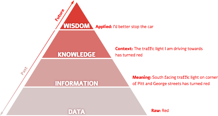
Over the past year I’ve had a few opportunities to run Disinformation Visualization workshops, encouraging activists, designers, statisticians, analysts, researchers, technologists and artists to visualize lies. During these sessions I have used the DIKW pyramid (Data > Information > Knowledge > Wisdom), a framework for thinking about how data gains context and meaning and becomes information. This information needs to be consumed and understood to become knowledge. And finally when knowledge influences our insights and our decision making about the future it becomes wisdom. Data visualization is one of the ways to push data up the pyramid towards wisdom in order to affect our actions and decisions. It would be wise then to look at visualizations suspiciously.
Centuries before big data, computer graphics and social media collided and gave us the datavis explosion, visualization was mostly a scientific tool for inquiry and documentation. This history gave the artform its authority as an integral part of the scientific process. Being a product of human brains and hands, a certain degree of bias was always there, no matter how scientific the process was. The effect of these early off-white lies are still felt today, as even our most celebrated interactive maps still echo the biases of the Mercator map projection, grounding Europe and North America on the top of the world, over emphasizing their size and perceived importance over the Global South. Our contemporary practices of programmatically data driven visualization hide both the human eyes and hands that produce them behind data sets, algorithms and computer graphics, but the same biases are still there, only they’re harder to decipher.
Reproducing Lies
Let’s set up some rules.
We don’t spread visual lies by presenting false data. That would be lying. We lie by misrepresenting the data to tell the very specific story we’re interested in telling. If this is making you slightly uncomfortable, that’s a good thing, it should. If you’re concerned about adopting this new and scary habit, well, don’t worry, it’s not new. Just open your CV to be reminded you’ve lied with truthful data before. This time however, it will be explicit and visual.
To deconstruct possible lies I suggest we use the content / structure / presentation model as three lenses through which we can analyse a graphic. Each of these layers is susceptible to manipulation. When it comes to the content of the message, even before it is visualized, the initial data could be truthful, but the way it was gathered could be manipulated. For example:
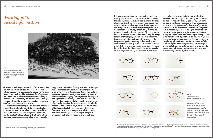
Should we legalize the killing of babies?
I would hope most of you would say: No.
But what if I ask you:
Should women have the right to their own bodies?
This time, I would like to think that most of you would say: Yes.
But then again, what if I frame it like this:
Should abortions be legal?
If framed as a survey question, only one of these three questions truthfully represents the so-called pro-life / pro-choice debate without choosing sides in advance.
Let’s investigate lies in the structure layer through an actual poll. Gallup has been surveying this issue with the American public for almost 20 years now, often multiple times a year. They frame the question in a slightly more political way:
With respect to the abortion issue, would you consider yourself to be pro-choice or pro-life?
And this is the data they received:
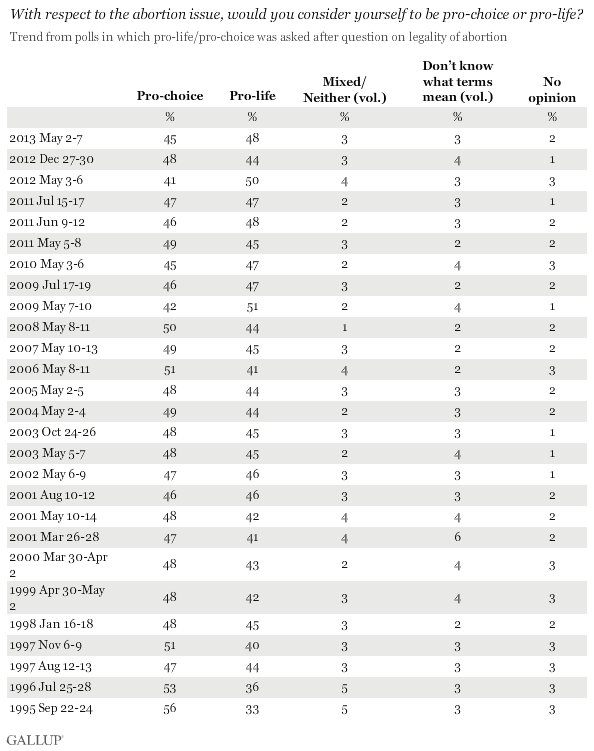
As a table it is really hard to quickly identify trends and changes in the data, but as a graph we can start climbing up the DIKW pyramid:
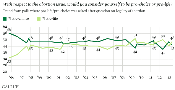
Gallup’s graph makes sure to plot every data entry and it marks the numbers along the lines at evenly selected intervals.
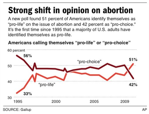
Back in 2009 when the AP wanted to use the data to tell a good story, all they needed was to skew the graph’s proportions a bit, change the starting point of the vertical axis and switch to thicker, less nuanced lines that based on the very same data emphasizes a clear trend in the graph. And a clear shift in opinion in such a huge ideological debate makes for a much more interesting story.
Earlier in 2009 when pro-life site LiveAction.org wanted to graph the same data to preach to the choire and say “we’re winning!”, it chose a much more selective reading from the data and plotted this graph:
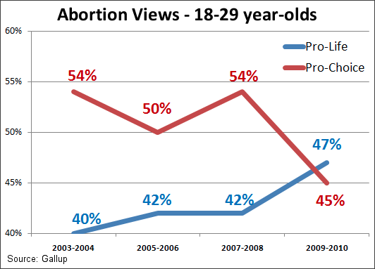
This time, no need to admit the public opinion was ever at the 1990’s low pro-life mark, so starting from 2003-2004 is fine. Focusing on a shoter time frame to tell a story of consistent increase helps too, as does the choice of 18-29 years old age brackets. There’s nothing about the data that isn’t true, but it is very selective.
If we use the same data as the first graph, published by Gallup, and extend it for two more years, the graph might look like this:
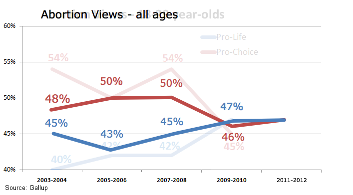
The image presents a much less definitive trend now. It still misrepresents the data, but less selectively. These selective readings are what we can consider as manipulations in the choice of structure.
When we get to the presentation layer, that’s when our options for manipulation really widen. We get to use contrast and color, size and composition, shape and typography, movement and interaction… every choice is an opportunity to suggest a specific reading of the data, an opportunity to lie while seemingly telling the truth.
Let’s continue with the theme of the abortion debate and examine this infographic from the pro-life site LiveCitizen.com:
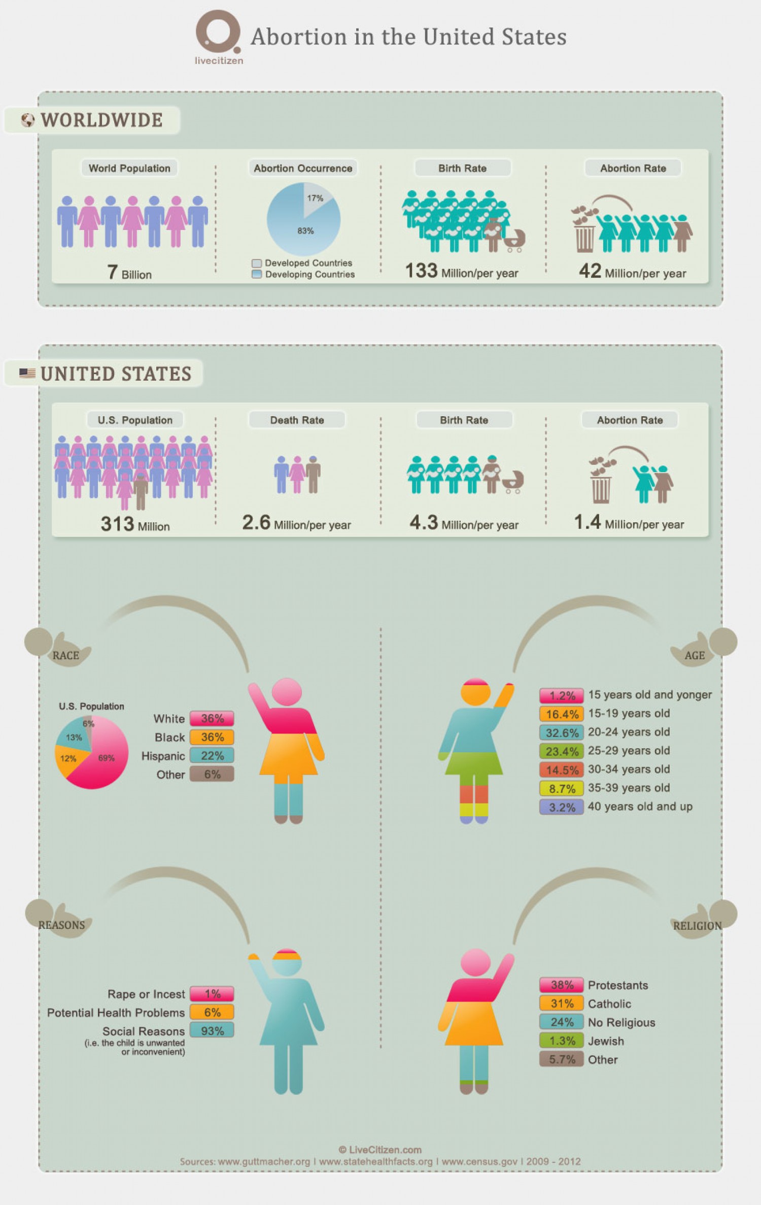
This infographic is packed with visual tricks. First, there’s the sheer volume of stats. Before you can even consider one statistic you are encouraged to examine the next. This helps to keep your guard down and ties the order of the stats into a coherent and directed narrative. Second, the use of generic icons to represent male and female elegantly expands to represent abortion as a mashup of a female icon, a fetus and a trash can. Third, the scale change between the worldwide abortion stats (42 million = 5 baby throwing mommies) and the US stats (1.4 million = 2 baby throwing mommies) subtly misrepresents the US as responsible for ⅖ of the world’s abortions. A more careful reading of the numbers would correct this visual misrepresentation, but who has the time to read carefully when there are four huge colorful baby throwing mommies coming up next?
This part of the visualization goes further to skillfully use more and more manipulation techniques. The “Race mommie” shows that even though black mommies are only 12% of the US population they throw as many babies as the 69% white majority. No word about any socio-economic correlation between the white and black communities. If we are interested in the reasons behind the baby throwing, we can look at the “Reasons mommie”, here 93% of the reasons are dubbed “social”, and since that might be seen as a bit abstract, the label explains: “i.e. the child is unwanted or inconvenient”. This short and snappy description is summing up the slightly longer and boring results from the source behind the numbers:
“Worldwide, the most commonly reported reason women cite for having an abortion is to postpone or stop childbearing. The second most common reason—socioeconomic concerns—includes disruption of education or employment; lack of support from the father; desire to provide schooling for existing children; and poverty, unemployment or inability to afford additional children…”
A Liberal Approach to Honesty
If you happen to be a pro-choice liberal, you might find it easy to criticize pro-life infographics, but what if the manipulative disinformation visualization is reinforcing your own world perspective? Would you still be as critical? Let’s try…
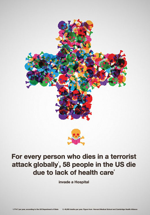
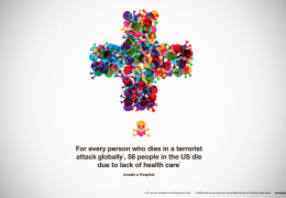
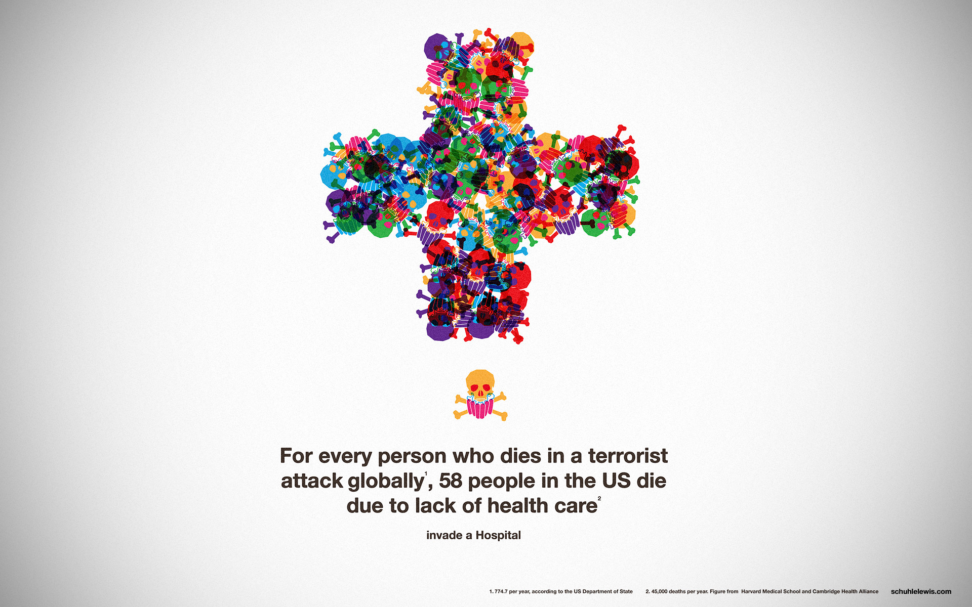
This pro-national health care graphic by Jake Lewis visually compares 58 deaths from lack of healthcare in the US to every single death of a person in a terrorist attack globally. It apparently hits two liberal birds with one stone as it advocates less foreign intervention in the so called War-on-Terror and more investment in health care for the poor and uninsured. It is also beautifully crafted and articulated with the tongue-and-cheek punch line: “Invade a Hospital”. It’s the kind of data-driven advocacy graphic to which many liberals reply: “Right on!”, admiring the clever juxtaposition and the sophisticated framing.
Yet, this seductive piece cleverly uses all three types of manipulation to tell a one-sided story masquerading as fact. First, the content. The first number in the 1 to 58 ratio is derived from the 774.7 deaths per year that the US Department of State marks as terrorism. Blogger Innocent Smith points out that the calculation is way off, as it averages years 1985-2005 when the average by the same department in 2005-2008 was 18,325.25. He goes on to argue both numbers are wrong with the latter deliberately trying to exaggerate the global threat of terrorism to legitimize the war on terror.
The 58 deaths per year due to lack of health care is marked as published by Harvard Medical School and Cambridge Health Alliance. NewsBusters.com, a conservative fact checking organization questions the source of the 45,000 deaths per year number and argues the media downplayed the role of Physicians for a National Health Program (an organisation advocacting for universal national health insurance) in this study.
Secondly, the structure of the comparison - global deaths in terrorist attacks and domestic deaths due to lack of health care. Why is this comparison even useful? The two categories are so uncomparable that putting them together could only be manipulative.
Third comes the sophisticated presentational / aesthetic use of the skulls. The single skull looks anything but scary, it is pirate-like and cartoonish. The pile of skulls on the other hand, even though it is the very same icon, is chaotic, uncontrollable and immediately conjures images of mass graves and violence. On a very subconscious level the graphic presents terrorism as innocent and childish and lack of health care as violent, aggressive and terrifying.
The result is a very powerful message which substantiates itself with facts. It is visual rhetoric, if not visual demagoguery. It attempts to present itself as the result of careful study and deliberation, doing the thinking for us so we can quickly and easily consume the conclusion.
Beautiful Evidence?
Making an evidence presentation is a moral act as well as an intellectual activity. To maintain standards of quality, relevance, and integrity for evidence, consumers of presentations should insist that presenters be held intellectually and ethically responsible for what they show and tell. Thus consuming a presentation is also an intellectual and a moral activity.
—Beautiful Evidence, Edward Tufte
In the introduction to his book, Edward Tufte, the leading scholar of information visualization talks of the moral grounds to which information visualization should strive. He talks of “universal principles of analytical thinking” as the foundations of information design work and opposes the role of subjective contexts like local customs, fashion and technology in their making. Tufte’s decision to title his book “Beautiful Evidence”, seems like an attempt to define the ideal presentation of data: to "delight both by the wonder of the spectacle and the accuracy of expression." Tufte does not deny the dangers of manipulative imaging, and devotes two chapters to warn us against these “unbeautiful anti-evidence”, but I would argue that a lie can still be beautiful and that even honest image making should not be regarded as evidence.
I am not sure we should expect the design of “Beautiful Evidence”, as much as we should learn to regard these visual expressions as a form of speech and therefore as “beautiful arguments”. In these beautiful arguments the delight, the wonder and the spectacle might actually stand in the way of accurate representation of reality. While Tufte acknowledges evidence presentation is a form of discourse, he practically advocates we limit the discourse and keep our images a-political. However too-often this seemingly scientific, fact-driven, a-political visual makes us drop our guard and de-politicizes these seductive beautiful arguments.
Our eyes are trained to process the visual environment as evidence, and to process the products of language as arguments. Therefore, whether beautiful or ugly, visual lies masquerade as evidence and slip under our radar. We, in return, readjust our worldview to accommodate these visual lies as we do when we witness evidence. As long as we do this, there will be those who will continue to tell these visual-lies, convincing us, and often themselves, that evidence will make itself evident and that subjective culture and political biases won’t creep in.
I am not advocating an iconoclastic anti-visual approach. I, like Tufte and many others, believe visual language should be an integral part of analytic thinking, deliberation and communication. But I suggest we do not strive for seamless visual communication. The straight line from data and information through visuals to knowledge and wisdom doesn’t exist and we should not pretend that it does. Rather than seamless design, data visualization should embrace the seamful approach that deliberately exposes the seams of the fallible human process of image making. One that acknowledges the image as an argument, as speech, as a part of visual language, to be debated with, questioned, talked back to or even visualized back to.
Mushon Zer-Aviv is a designer, educator and media activist based in NYC and Tel Aviv. You can read more by him at http://mushon.com and follow him at @mushon.
Share this post:


