


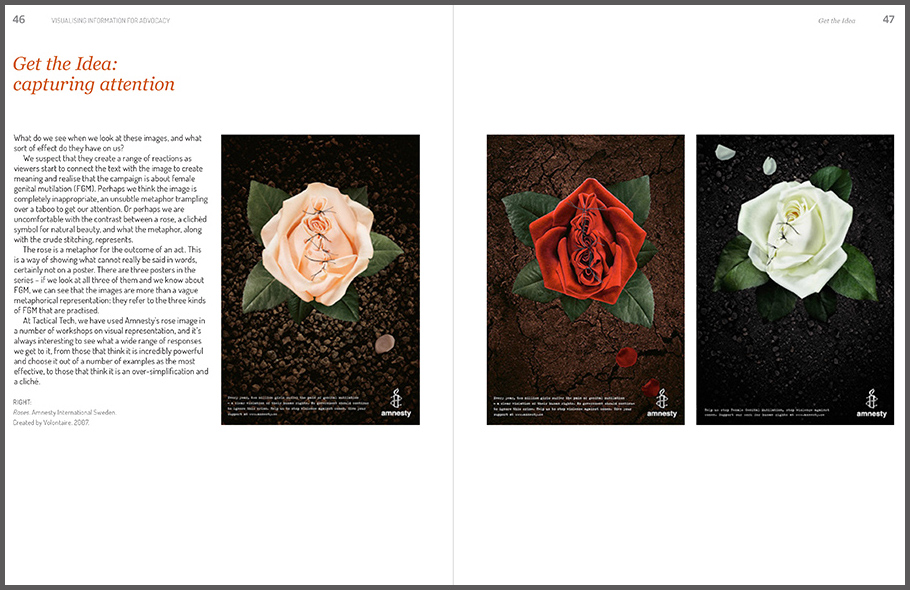
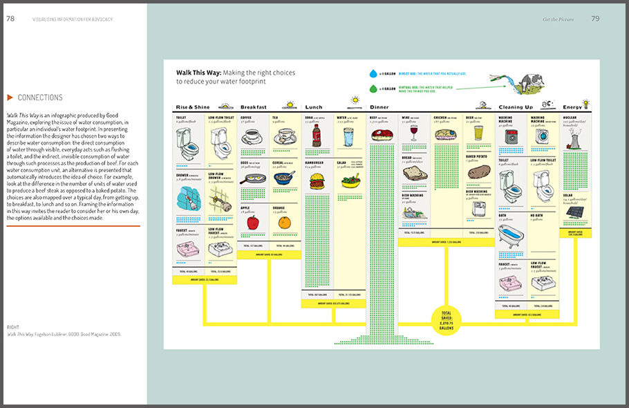
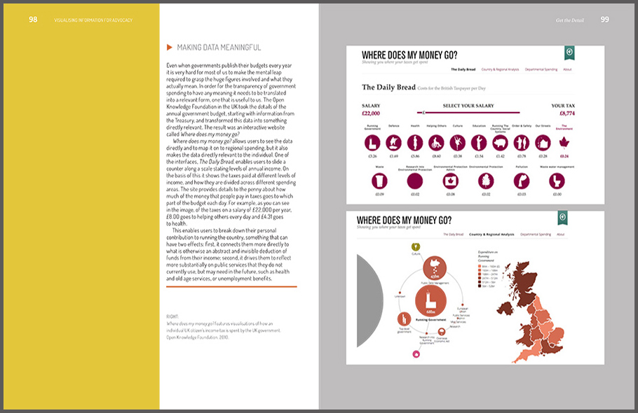
By Mushon Zer-Aviv, January 8, 2016
How the simplistic network diagram came to dominate our imagination and why we shouldn’t blindly go with the flow.
This is the third post in the #RDFviz blogpost series published towards the Responsible Data Forum on Visualization that would take place in New York on January 15th, 2016.
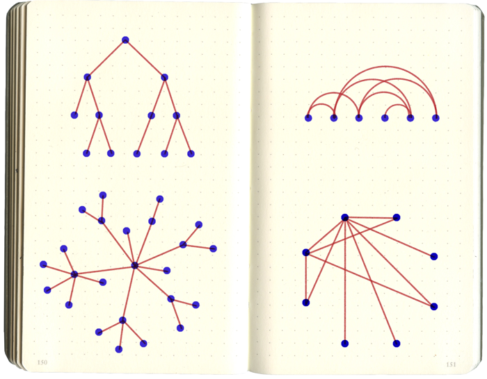
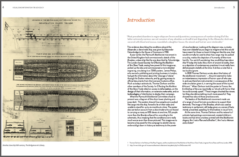
Let’s take a sheet of paper, draw a few points (we’ll call them nodes), connect them with lines, (we’ll call them edges) and there we go, we have ourselves a network. Right? Well, yes. And no. I mean, that’s not the whole story.
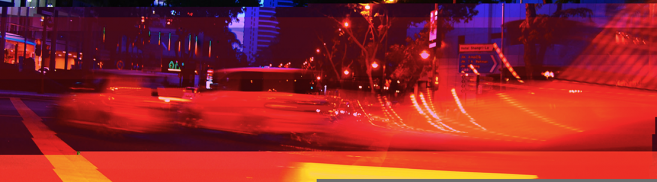
Stuck in traffic
A few years ago when I designed the maps for Waze Mobile, the GPS navigation company, we faced a complicated challenge. Essentially a street map is a network, with every junction being a node, and the roads being the edges. So, much like the network we’ve just drawn, the map did a pretty good job of visualising the geographical layout of nodes and edges but this was not enough. While the main purpose of the App is to tell you where to go, it also tries to visualise the traffic around you to better inform you of the traffic jams you have avoided and to prepare you for those you will have to drive through. As soon as we start asking what’s happening on the roads between every junction - the specific traffic on that segment (we’ll call that the flow), things start getting complicated, fast.
Traffic is a very dynamic type of flow, it can be light, it can slow down, it can be heavy and it can come to a complete standstill. Some roads are two-way while others flow only in one direction. We had to indicate which directions are drivable as well as visualising the traffic travelling in each of these directions. But wait, there’s more. What if the road has multiple lanes and the traffic jam is only for those turning left, while we want to turn right and our lane is clear? And what if we're travelling on a very long road and the traffic slows down only on a limited segment?
It gets even trickier. On Earth Day in 1990, New York City's Transportation Commissioner decided to close 42nd Street, a major road connecting Grand Central Train Station and Times Square. "Many predicted it would be doomsday," Commissioner Lucius J. Riccio told the New York Times. But surprisingly, not only did closing the street not result in bad traffic, it actually improved it. New York City drivers would usually flock to 42nd street, the widest street around, slowing traffic for everybody while the smaller streets around it remained largely empty. By taking the 42nd street option off the table, the flow of traffic actually improved. This surprising result could be attributed to what network theory calls Braess's Paradox. It states that adding edges to a network will not necessarily result in a better flow and may sometimes even lead to congestion.
Now let’s go back to the network we drew earlier. What can we say about its flows? Nothing really, hmm? Well, that’s a problem. Especially when in recent decades, we’ve come to think of more and more aspects of our lives in terms of networks.
Everything’s connected, man…
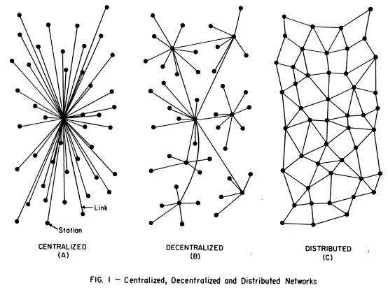
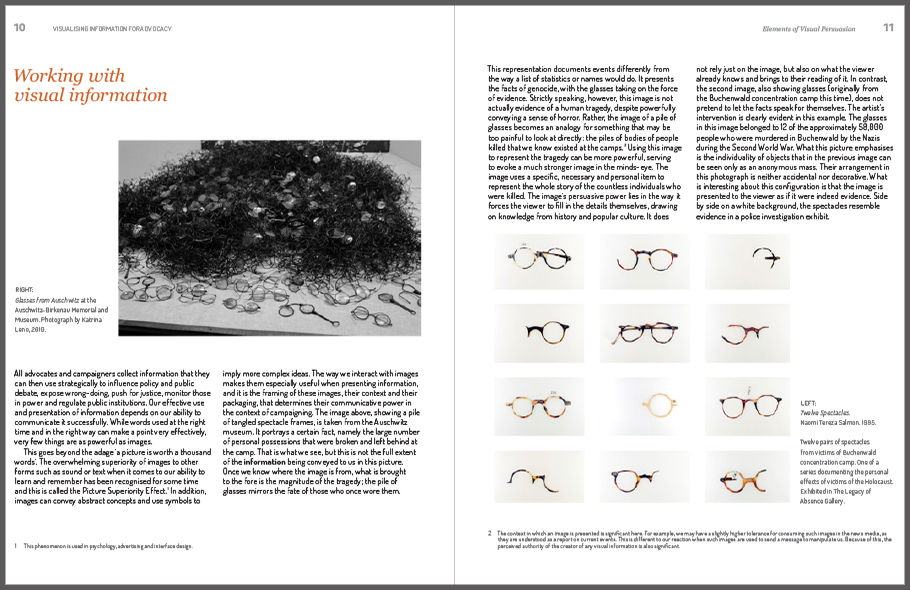
In 1964, RAND scientist Paul Baran drew this famous diagram that shows 3 possible network topologies and their levels of vulnerability in case of a nuclear attack. The distributed network was chosen for the military communication networks that set the foundation for the TCP/IP protocol which is at the core of the internet we use today. Though most of our online interactions today take place over proprietary centralised networks and infrastructure, the myth of the internet’s birth and the popularity of social networking platforms have captured our imagination and informed our conception of society and power relations in terms of a distributed network. More recently, advanced research into biotechnology, neuroscience and machine learning have popularised experimental research into neural networks such as the cutting-edge of artificial intelligence and science fiction-like post-humanistic visions.
There’s something very attractive about seeing everything as connected; it serves a basic need to rationalise everything in terms of cause and effect. It offers the mechanics of countless feedback loops that, if we could only count them all, would allow us to uncover ‘the big picture’. There’s also something extremely wonderful about the aesthetics of the network diagram, its volume, its physics, its emergence, its power. It is like the rendering of a hidden truth suddenly emerging before our eyes and taking us behind the scenes of everything we want to see through it.
And indeed if we like, we can think of almost everything in terms of networks. Every place, institution, being, object, word, concept, cell or atom could be a node and as soon as we find any possible way to connect them with a few other nodes, we’ve got ourselves a network. The network is a very flexible and abstract model and can even allow us to overlay other networks and create super-networks and then run network mathematics on them to further analyse the inner workings of the complex emergent system we just discovered.
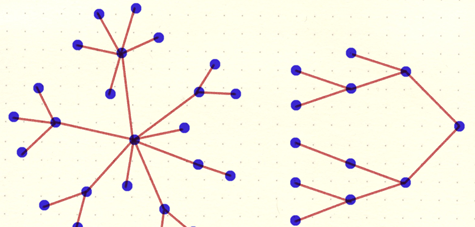
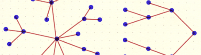
It doesn’t take too many nodes and edges for a network to become very complex, and for us to get utterly trapped in its web. A whole sub-category in the science and design of data visualisation is devoted to network graph drawings, trying to come up with new graph layouts that would untangle the network and extend cognition. There are tree layouts and force-directed graph layouts, there are arc diagrams, radial layouts and globe layouts… all attempting to better understand and differentiate between the nodes and the edges on a two-dimensional plane.
But while these layouts may help communicate the network’s structure, they do little to expose the flow and more importantly, the protocol that governs it. Alex Galloway and Eugene Thacker defined protocols as all the conventional rules and standards that govern relationships within networks. They argued that “If networks are the structures that connect people, then protocols are the rules that make sure the connections actually work.”
If we can’t see the flow or understand the rules of the network embedded in its protocol, we can indeed allow ourselves to imagine the endless possibilities of connectivity. It is a part of what makes these network diagrams so inspiring and gets some of us excited about distributed networks and imagine them as the people’s answer to the centralised power of states and corporations. But it is also what makes networks so misleading. New York drivers on that Earth Day in 1990 had a simplistic model of the Midtown traffic flow, one that expects the largest road to be the fastest. Today a GPS navigation system might implement a protocol that would help these drivers circumvent this human error. But if we’re subject to the rules of an opaque protocol, it begs the question, who’s driving?
The network investigation model
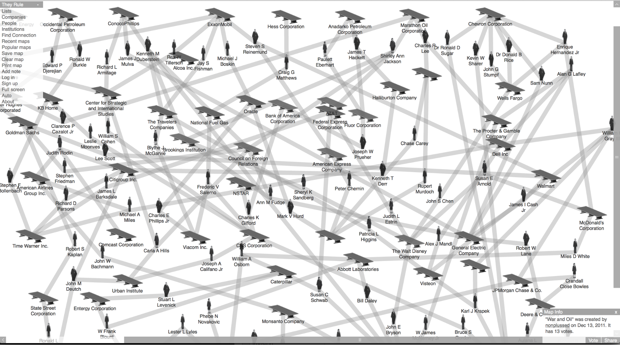
They Rule / Josh On
Today, as networks become the leading model for power and control, visualisation of complex networks has an important political role. In 2001, one of the pioneering websites to assume that role was Josh On’s TheyRule.net, a network diagram authoring tool which created graphs of America’s most powerful company boards and their members in an attempt to identify possible conflicts of interests in the echelons of power. TheyRule, later continued by LittleSis and other investigative activist tools like OCCRP’s VIS (Visual Investigative Scenarios), followed an investigative network model developed by law enforcement and investigative journalism and popularised by police dramas like The Wire.
According to the networked investigation model, the information puzzle can be solved by collecting and connecting the missing links. Data becomes the currency and the network is the model that structures it. The larger the network we draw, the more possibility we have of navigating within it. And when it grows faster than we can comprehend, network analysis algorithms step in to replace the human investigator. Hence every bit that can be captured is captured, in the hope that it might help unravel the network structure beneath.
At this point, it would not be unreasonable for your inner Edward Snowden to be sighing in silent frustration. The NSA and other governmental and commercial spying enterprises are using precisely the same networked investigation model that helps good-doers go after corrupt politicians and organised crime, though their motives, their objectives and, specifically, their resources are very different. The iconic image of scruffy detectives in smoky rooms connecting the dots between notes and blurry photographs pinned on a cork board has been infinitely extended to such a degree that it is now the cork board itself that does the pinning and connecting. The larger the cork board gets, the smarter it becomes and the more connections it can draw. Both governmental and non-governmental investigators often have to untangle huge associative webs of connections, following dead-ends, bordering on flimsy conspiracy theories, and like those New York drivers on Earth Day, getting caught in bad traffic caused by a misreading of the flow.
A new political role for network visualisation
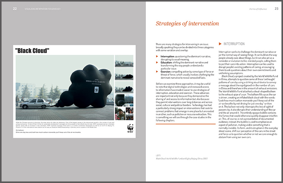
Aspirational networking has become a managerial ideology with endless possibilities for intelligence and control. As we’ve seen, drawing dots and lines is easy, but the result quickly gets hard to comprehend. What we’re left with is the aspirational networking ideology, in which everything is connected (man) and nothing is impossible, as long as you don’t expect people to be able to make sense of it. Networks are not evil, they’re just largely misunderstood. This makes the task of visualising networks even more crucial for us puny nodes who still seek to maintain some political agency.
But how do we do this?
First, we should extend the core network terminology beyond nodes and edges to also include flows and (as per Galloway and Thacker) protocols. But can flow and protocol be visualised? Yes, they can, and they already are. The following are just a few examples.
Volume: not all flows are created equal
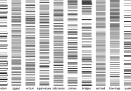
Decades of research into visual perception have proven that position is the most legible visual property we can use to map any type of data and hence most network layouts are differentiated by the formation of nodes and the data it represents. As long as the flow is not the question, a network diagram can prove quite useful. For example, social media analysis often uses a network diagram to map ‘@mention interaction’ on Twitter or the viral spread of a message. In these cases, the actual content of the messages (the flow) is only secondary to the questions of how they spread, and the Twitter networking protocol is simplified and familiar enough to not require any extra visual encoding.
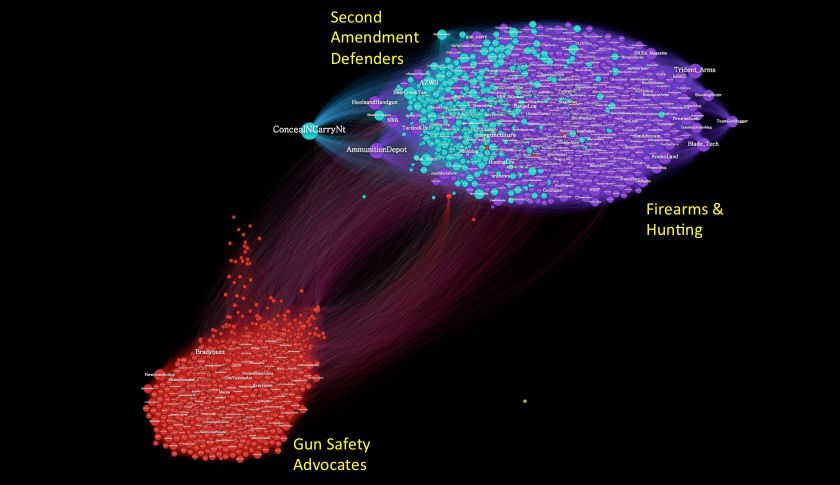
Gilad Lotan, Betaworks
While most network layouts focus on formation, clustering and categorisation of nodes, some networks try to differentiate between edges and to visualise their dynamics. Investigative journalists and civic society organisations that ‘follow the money’ often use networks to map not just general connections but to specifically signify the volume and directionality of the financial flow. As long as the flow is standardised and comparable (like money is) encoding volume and directionality, if carefully handled, can make for a pretty insightful network diagram.
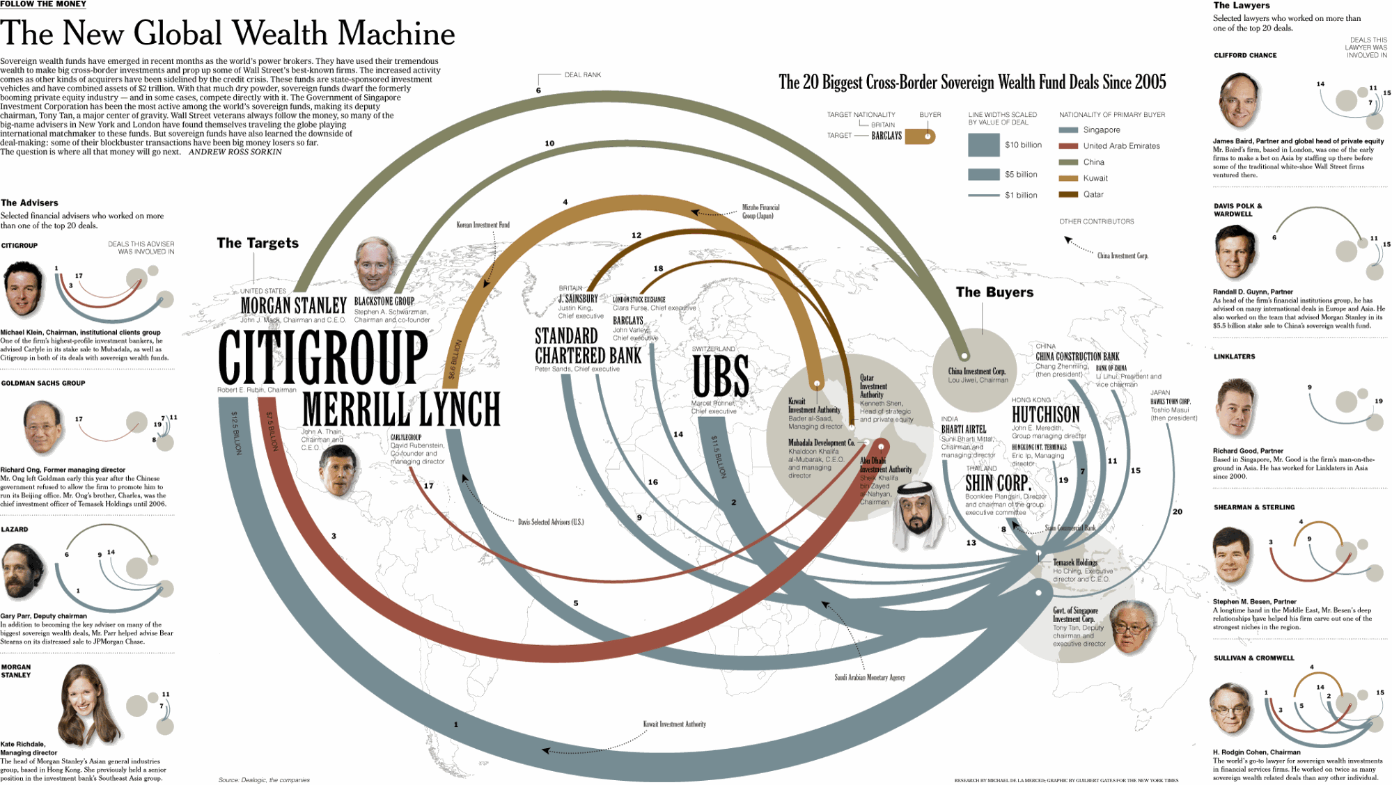
Follow The Money / By Andrew Ross Sorkin, The New York Times, 2008
The traffic maps we worked on at Waze fall into this category as well. At the end of the day, we presented the flow of cars, and at the end of the day what mattered the most was how much time it takes for a car to get from point A to point B. While designing the map, I tried to subtly indicate the difference between travelling in busy urban areas versus choosing a more scenic route, going through parks and past lakes, but this was not something that the network could easily visualise. Neither could we simply visualise how potentially dangerous one path might be in comparison to another, or how fuel-efficient it would be to take this turn or the next.
When the flows themselves are incomparable the problem becomes even bigger, as the big picture loses its meaning when the collected relations fail to present an aggregated insight. When Google decided to turn all our email contact list into friends in one of their many failed attempts at social networking, it was due to their simplistic interpretation of their users’ social graphs. Your classmate, your sister, your boss, your student, your landlord, your client, your lover and some salesperson might all be nodes in your social graph, but the flows of your correspondence with them are incomparable and hence mean nothing to you in the aggregate. The same can be said about most attempts to visualise the social graph, which could never offer you much more than to serve a basic narcissistic pleasure of seeing your image portrayed at the centre of your social life.
Networks need narrative
Contemporary technology always serves as the popular metaphor for thinking. Whether it was the steam engine, or the computer, humans like to view their brains as machines and thinking as a sophisticated technological process. As neural networks are becoming a leading model for researching and modelling logic and data processing, the network is becoming the visual metaphor for thinking itself.
But when we visually examine a ‘mind map’ (a network diagram representing thought) our eyes wander, trying to grab a node to start from and follow through the complicated stream of consciousness. Reading is a linear process and there’s not much we can read from a non-linear aggregated view of thought. Mind maps often serve as note-taking tools, but their final result is not as valuable as the documentation process itself. A mind map that visualises its authoring process would be much more readable and useful when shared or inspected after the fact.
We experience life as a narrative, not as a map and certainly not as networks. A network diagram rarely represents static relations. Narrating a flow through the nodes in the network is a useful way of examining it, whether as an example of its dynamics or as a way of highlighting specific insights. How was the network constructed? How should it be read? If documenting a narrative through the nodes and edges helps explain the flow and even the protocol, it could become an essential feature in the diagram.
Yet we might find that not every network has a story to tell, or that not every story is worth telling. For that matter, not every network might be worth networking.
Directionality: an implicit protocol
If life and reading are experienced linearly, direction implies both a narrative and a protocol. A tree layout, for example, represents networks with an explicit hierarchy. Nodes can diverge only in one direction and their flows conform to the protocol embedded in their structure. Family trees visually represent the genealogical flow and maintain its protocol.
Mapping time onto the network can also serve to suggest a reading direction, an explicit flow and sometimes teach us about the protocol. For example, the distributed version control model of networked collaboration on software projects (like the one used by Git and Github) is heavily based on time as an organising principle. In that sense, Github’s network diagram models not only the development of the code but the network’s very dynamics of collaboration. And like text, like code and like time, it can be read in sequence from one side to the other.
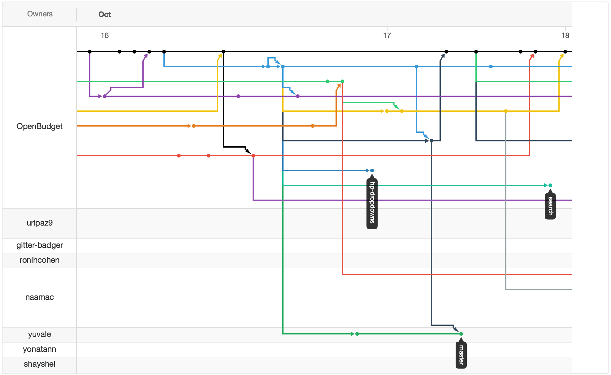
Screenshot of the oBudget.org project’s Github collaboration network
Visualising algorithms: a humanistic call to action
As data grows ‘bigger’, and computer algorithms become more complex, more control is moved behind the scenes. Data is processed through computer networks following opaque protocols and what finally gets presented to us as the final visualisation is usually only the tip of the iceberg. There are stories processed in these huge rule-based systems of automation, but they are not the stories we tell, they are the stories that tell us.
Visualisation is for humans. Computers don’t need anything to be visualised to them, and in any case, are not programmed to visually interpret it the way we can. We’ve been using visualisation mainly to understand data, but more recently there is a growing need for visualisation to assume its humanistic role and visualise algorithms.
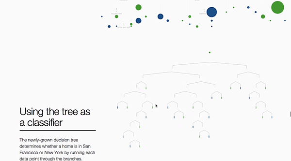
A visual intro to Machine Learning Part 1 / R2D3: Stephanie Yee & Tony Chu
Visualising algorithms is still a small fringe in the visualisation world. It is mostly academic and so far has mainly served an internal maths and computer science discourse. But the potential for visualising network protocols is huge. Rather than aestheticize the opaque wonders of abstract networks, a humanistic visualisation could educate us about the protocols that govern us and potentially even provide us with the means to adjust them.
Conclusion
Only some of our proposed solutions for visualising the Waze traffic flows were ever put to the test. There’s only so much you can visualise when you want the driver’s eyes on the road rather than on the screen, interpreting nuanced network visualisations. But the trend towards self-driving cars, led by Waze’s new owner, aims to take the human factor out of the equation completely.
While the question of whether humans should drive their own cars is up for debate, I would strongly argue against the wider trend driving us away from our agency in relation to technology at large. It is quite mind-boggling to think that network algorithms do not see points connected by lines, while we cannot even imagine networks without them. As abstract, rudimentary and confusing as they may be, networks are an essential construct of our 21st century lives and we need the conceptual and technological tools to be able to analyse them.
Once we acknowledge the anatomy of the network as more than the formation of nodes and edges and their layout, we can use them carefully, bearing in mind that:
- Not emphasising the visualisation of the flow implies that only the layout of nodes and edges is enough to tell the whole story.
- By presenting a finite inventory of nodes and edges, we might be implying that what’s presented in front of us is the full network and no other nodes or links are involved.
- A network is an extremely flexible and abstract model, and wandering through its nodes and edges might quickly lead you in circles, following dead-ends or developing dubious conspiracy theories. Handle with care.
- Networks need narrative, both as a layer of annotation and as a way to present exemplary network flow.
- Directionality is important and can be a useful way to lay out the flow and even the protocol of some networks.
- Time is an organising principle in our lives and could sometimes serve a similar role in the visual representation of a network.
- Algorithm visualisation is the next frontier in network diagrams and for data visualisation at large. This is a call for humanistic agency in complex systems.
Finally, before we rush to join the dots and think of everything in terms of networks, we should really ask what makes a network model necessary in this case? Do we want to examine the relationships of the nodes? To compare the capacity of the edges? Can we really analyse the intricacies of the flows? And are we able to analyse the network’s protocols? And if we can, can we affect them?
If everything is a network, nothing is a network. But if this thing is a network, this is why you should care.
![]()
Further reading
The Exploit - A Theory of Networks / Alex Galloway and Eugene Thacker
Visualizing Complexity / Manuel Lima
Visualizing Algorithms / Mike Bostock
Responsible Data Forum: Visualization
Network Pessimism / Alexander R. Galloway
This article was written by Mushon Zer-Aviv who is a designer, educator and media activist based in NYC and Tel Aviv. You can read more by him here and follow him at @mushon.
Share this post:


