


By Mushon Zer-Aviv, October 27, 2014
Since I first laid my cursor on Schooloscope.com it intrigued me as an exceptional case in the world of open data and information design. The chain of events that led to the site’s termination is an important story, which I believe should be chronicled and told.
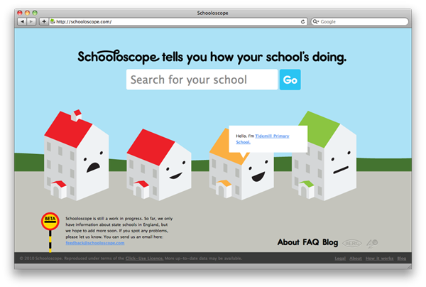
Schooloscope was the brainchild of Berg London, a multitalented design studio. It launched in May 2010, funded by 4iP, Channel 4′s venture division that invested in innovative digital formats with a focus on public service projects. The site took performance survey data (Ofsted) about state-run primary and secondary schools and layered it on a map to visualise proximity, size, performance, trends and a whole variety of other parameters. This is how Matt Webb, Berg's co-founder presented it (09:34-10:30m):
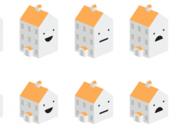
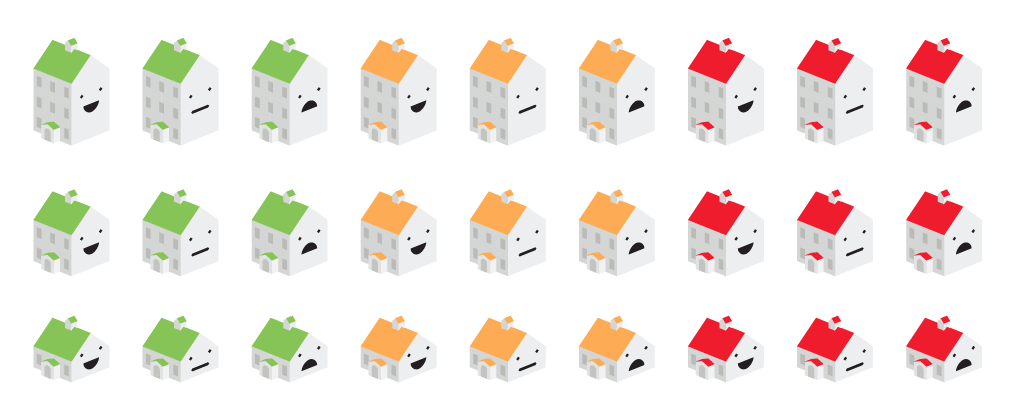
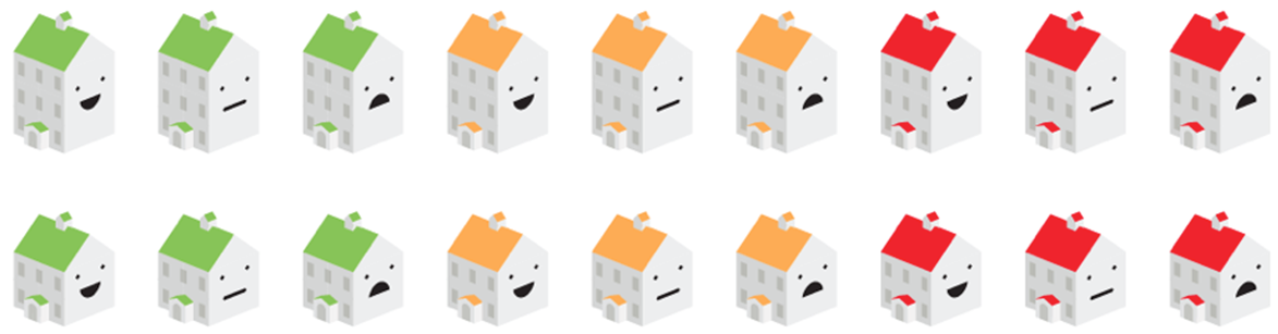
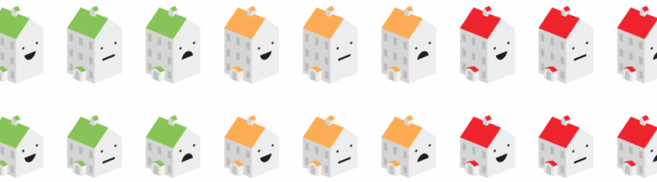
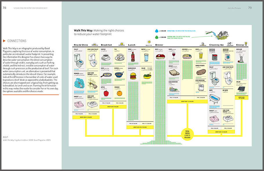
Work on Schooloscope started in 2009 and was extensively shared on Berg’s blog, documenting their “material exploration” process. They took the Ofsted school performance inspections data and combined with the Department for Education’s school attainment league tables they analysed the data with the idea of better communicating the information. The process led them to prioritise specific data attributes and to map them onto multiple visual variables of cute cartoon school buildings. Berg adopted an interesting visualisation technique called Chernoff Faces which suggests we could exploit our sophisticated visual perception of faces to map complex data visualised as facial properties. After further researching the topic they decided to only use the mouth’s smile/frown as an indicator of the children's happiness. The size of the icon indicated the size of the school and the roof color indicated test scores from good (green) to bad (red).
From A to Z to A. From Data to Representation and Back to Data
Schooloscope excelled in its ability to condense and then expand the data as the user drills in. Their gradual interaction is a lesson I was very inspired by and often try to implement in my own work. Scanning the map quickly communicates four data points on every school: location, happiness, trend and size. As you hover over the school icon it tells you its name in a human language annotation that reinforces the reading of the icon using wordings like “I’m Bromley Hills Primary School. My exam results aren’t as good.”
Click and we get a mini view with a more extensive summary. Another click and we’re getting deeper into the full view, starting with a short, highly informative, almost editorial lead paragraph that builds the interest to further explore the school’s data. The next paragraph further expands using aggregated data, linking to sources and to deeper filters, it also communicates trends, all in a simple to understand language.
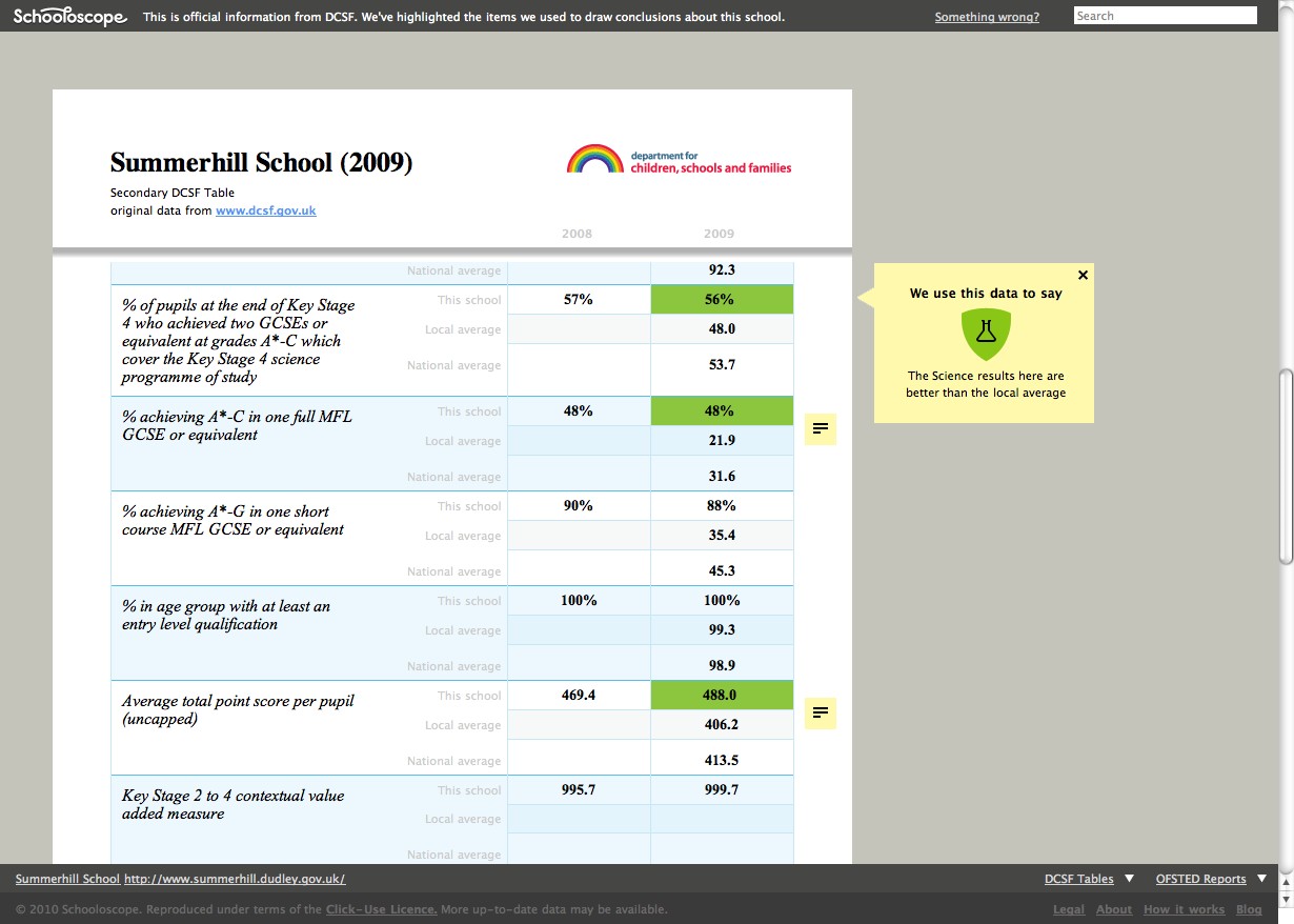
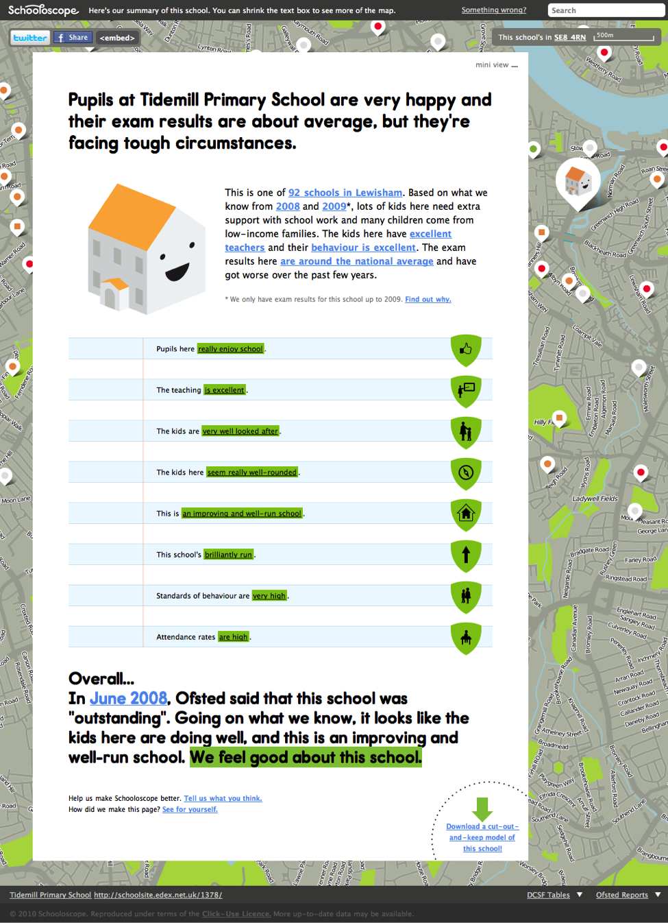 Schooloscope School page
The page scrolls to communicate some specific digestible data points like how much do pupils like their schools, how good are the teachers and administration and so on. Each data point is marked with a qualitative assessment using the previously established green-orange-red colour scale.
The report concludes with another highlighted “overall” summary paragraph using Ofsted summary terminology like “outstanding” or “inadequate” and with a look into the future based on the data of the past. The last sentence is highlighted and colour-coded and concludes with statements like: “We feel good about this school“ or “We are uncertain about this school” or “We feel concerned about the challenges facing this school”.
Admirably, Berg included a link to explain how they processed the data with more links to annotated tabular data and from there to the original spreadsheets. Every summary provides yet another link, inviting people to help Berg improve the way the scores are being calculated. And apparently some of that feedback was indeed taken into account.
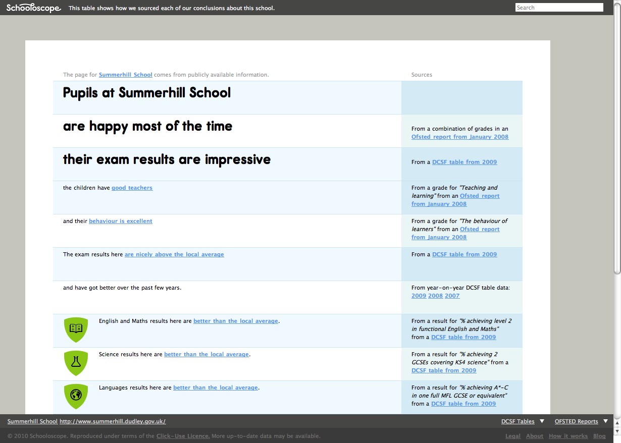 Schooloscope sources - demystifying the algorithm
 Schooloscope Data - tying between the analysis and the source
Never before Schooloscope’s launch nor after its closure have I seen such a thoughtful and gradual interaction, taking measured and comprehensive steps from the aggregated representation all the way back to the source data in a way that is educating, delightful and empowering. Sadly this lesson was lost with the disappearance of the site from the pages of the WWW.
Too cool for schools
Schooloscope’s delightful and enlightening user experience quickly translated to a wide public and professional interest and to substantial traffic. These also led to the site being placed high on search results for school names. Berg hoped to make Schooloscope self sustaining within a year with its own business model justifying the 4ip seed funding. But this never happened.
While some parents admitted the site was of great help for them choosing where to live and where to send their kids to school and some even used it to demand change, the site received quite a lot of complaints from teachers, head teachers and parents who were offended by the way their schools were represented on the site.
Maintaining the data proved more difficult and laborious than initially expected, with Ofsted often changing the way they measure the schools which led to Schooloscope’s algorithms breaking. The data released was not always complete or came late, and by the time it could be formatted too many schools were showing old data that was no longer representative of their current status.
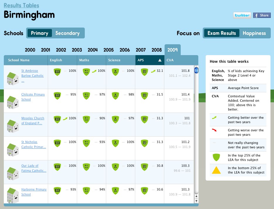 Schooloscope - School comparison by exam results
But even if the Ofsted reports and the DCSF achievement tables would have been released through a flawless API, seamlessly updating the Schooloscope representations in real time, it wouldn’t have been enough.
"As an example of why Schooloscope is lacking something, our old childminder recently dropped from an "Outstanding" to "Very Good". How did Ofsted arrive at this assessment? They spent over fours hours on their inspection going through all of the paperwork, and (according to our childminders) just 15 minutes with the kids and carers. During the inspection a couple of minor administrative errors were discovered, so they dropped a few points. I'd much rather the inspector spent four hours studying the quality of care and interaction with my children, as opposed to checking how good the carers administrative skills were."
— Something Missing on Schooloscope, James Webb
Apparently the source data itself is highly controversial. Both the DCSF league tables and Ofsted’s measurement are widely criticised for misrepresenting the children, the teachers and the schools. In fact, in 2010 one in four schools in the UK boycotted the SAT tests and refused to allow their pupils to be tested. This put Berg in a predicament which they had to address by redacting some of the data.
"Were we to update Schooloscope right now with the latest data, a lot of schools on the site would “disappear” – becoming grey dots on the map, their pages now disabled. That doesn’t feel like the right thing to do. We’d like to find a way to compare like with like, and we’d like to be able to recognise schools that participated in the boycott without removing them from the site."
— 2010 Primary School League Tables | Schooloscope
But it wasn’t only the data’s accuracy that came under attack. Some of the criticism was directed at Schooloscope’s analysis of the data itself. Specifically at a core feature in Schooloscope, its “happiness” measurement. Schooloscope measured school happiness by combining a few data points in Ofsted reports: Care, Guidance and Support, Teaching and Learning, Enjoyment of Pupils, Behaviour and Attendance. The site made a point by stressing that happiness was an equal if not greater factor in assessing the schools success. The lovable smiley and frowny faces spread all over the map were a delightful and effective representation summarising quite a lot of data. But it wasn’t as delightful if your children, your pupils, you, were depicted as unhappy.

What Chernoff identified as humans heightened ability to identify faces has actually backfired. As long as the stats are satisfactory and the schools are smiling all is well, but a sad school surrounded by smiling ones simply feels like it’s being laughed at. The result, rather than being an informed citizen gradually investigating the data, was taken as an insult. After all, would you send your kids to a sad school? I know I wouldn’t. Actually, what kind of parent would send their children to a sad school? Well, the kind of parent that doesn’t have a choice.
The case of Schooloscope and the wider question of public access to school data challenges the belief that sunlight is the best disinfectant, that government transparency would always lead to better government, better results. It challenges the sentiments that see data as value-neutral and its representation as devoid of politics. In fact, access to school data exposes a sharp contrast between the private interest of the family (best education for my child) and the public interest of the government (best education for all citizens). When families that are privileged enough distance their children from “sad schools”, the situation only gets sadder and this well meaning act of transparency leads to further inequality.
Cutting School
"When it comes down to it, Schooloscope is a publisher. Although the majority of our feedback has been good, some of it points out flaws. While we were under heavier development, this was really useful because we could make improvements responsively. But if we’re not able to be as responsive, then what Schooloscope would actually be doing is publishing information we can’t stand behind 100%. And we don’t want that!"
—Shutters Down | Schooloscope
A little over a year after its launch, Berg was responsible enough to shut Schooloscope down realising it cannot keep maintaining and developing it. As sad as I was to see it go, I commend them for this decision. Other sites have appeared since trying to contextualise, visualise and map official school data, both in the UK and worldwide. For better or worse none of these attempts was as powerful as Schooloscope. In Israel for example, following a supreme court ruling, the Ministry of Education was forced to release similar standardised test achievement tables. Soon after, Madlan, a housing analysis site used the data to augment its real estate maps. While the transparency activists fighting to release the data were hoping for more government accountability and better informed communities, the result was further gentrification and rising inequality. Bound by Freedom of Information laws the Ministry of Education did the last thing it could to fight this, it cancelled the tests.
I don’t want to say that no good could ever come from making this type of data accessible to the public. We can learn from GreatSchools.org’s attempt to balance official government data with ad-hoc user ranking and reviews, an approach Berg intended but never gotten to experiment with on Schooloscope. We can also consider ProPublica’s angle with The Opportunity Gap that frames comparative school data first and foremost as a political issue, directing the focus on government policy with the prompt “Is Your State Providing Equal Access to Education?” We can probably find other examples that took different stabs at the matter, and yet it seems like the complicated challenges at the core of school data transparency are not going away.
Berg’s Schooloscope.com remains a prominant case study for opening government data, even post-mortem I am still inspired by its many successes and challenged by the questions framed by its demise. Is opening school data even a good idea? How could it remain sustainable? Is the for-profit model really viable? And when it comes to the conflicts between the public and the private, is open data and its representation really value-neutral? Ultimately, whether it be school sites, hospital comparison tables, or crime maps, are these open data initiatives really built to fight for change? or are they simply normalising the status quo?
The right answer to all of these questions is obviously:
Yes.
And No.
No school would teach you that.
But you could get your first lesson from Schooloscope.
Mushon Zer-Aviv is a designer, educator and media activist based in NYC and Tel Aviv. You can read more by him at http://mushon.com and follow him at @mushon.
Share this post:


